1. Overly Complex Designs

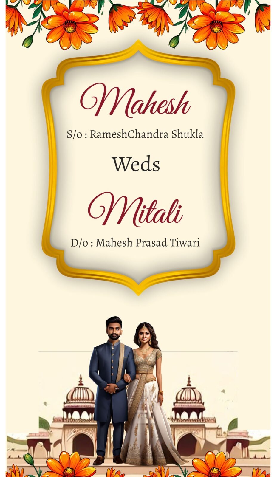
When using an online wedding invitation maker like cardmakerz.com, one of the first pitfalls to avoid is the temptation to create an overly complex design. While it may seem appealing to use all available design options, it’s essential to prioritize simplicity and readability to ensure your invitations are both elegant and user-friendly.
Simplicity in design doesn’t equate to being dull or uninspired. On the contrary, a well-executed minimalistic approach can exude sophistication and class. To achieve this, balance different design elements such as fonts, colors, and graphics. Choose no more than two or three fonts that complement each other. Mixing too many different fonts can create visual clutter and distract from the essential information.
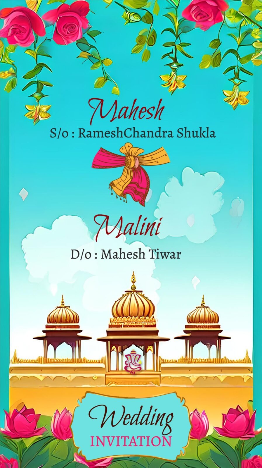
Color selection is another crucial aspect. While a vibrant palette can bring life to your invitations, it’s essential to use colors that harmonize well together. Stick to a cohesive color scheme that aligns with your wedding theme and avoid excessive use of bold colors, which might overwhelm the reader.
Graphics and other design elements should be used sparingly and strategically. Incorporating too many decorative elements can lead to a crowded look, making it harder for recipients to focus on the key details of the event. Instead, select a few tasteful graphics or patterns to enhance the design without overpowering it.
The use of white space—or negative space—is arguably one of the most effective tools in achieving a polished and organized look. White space helps to create a structured and clean design, allowing the eye to rest and navigate the content easily. It frames the text and other elements, ensuring that they stand out and are legible.
A well-organized, visually appealing invitation sets the tone for the entire wedding. By focusing on simplicity and a balanced design, your wedding invitations will not only be beautiful but also functional, giving your guests a clear and delightful preview of the big day.
Ignoring Color Schemes and Themes
One significant error that many couples make when designing their wedding invitations online is neglecting to harmonize the colors and themes with their overall wedding aesthetic. The invitation sets the tone for the event, and a disjointed color scheme can create a discordant impression. It’s essential to select colors that not only appear appealing on your screen but also print well. Digital hues can sometimes look very different on printed paper, thus rigorous testing is crucial.
A common pitfall involves clashing colors that diminish readability and aesthetic appeal. For instance, using light text on a bright background can make it nearly impossible for guests to read the details. Similarly, overly bold or dark colors might overpower the invitation’s design elements. It is recommended to steer clear of color combinations that can create visual discomfort or lead to readability issues.
When using an online wedding invitation maker like cardmakerz.com, ensure you coordinate your chosen palette with the wedding’s theme and colors. This alignment creates a cohesive look and helps in conveying the desired atmosphere of the event. For example, a beach-themed wedding might benefit from soft blues and sandy beiges, while a vintage wedding could look stunning with muted pastels and rustic tones.
To avoid mistakes, test various color combinations using printed samples. Tools provided by platforms like cardmakerz.com can help, offering preview features to assess how colors will appear in print versus on digital screens. Another essential tip is working closely with your printer to verify the final color output aligns with your vision.
Incorporating the correct hues and ensuring harmony with the wedding’s palette will elevate your invitation’s overall appeal. This attention to detail reflects your style and sets the stage for a beautifully coordinated event. Choosing the right colors guarantees that your invitation is both stunning and functional, setting the perfect tone for your special day.
3. Poor Copywriting and Typos
Even the most beautifully designed wedding invitation can fall flat if it contains poor copywriting or typos. The language used in an invitation sets the tone for the entire event, and mistakes can lead to confusion or even embarrassment. Therefore, it is critical to employ clear, concise language and thoroughly proofread each word on the invitation.
Common errors that can easily occur include incorrect dates, misspelled names, and awkward phrasing. An invitation should provide all necessary details—such as the date, time, venue, and dress code—in a straightforward and easy-to-understand manner. Ensure that the names of the bride and groom, as well as any featured family members, are accurately spelled. Simple mistakes like these can significantly detract from the professionalism and appearance of the invitation.
To improve copywriting, follow a few essential guidelines. First, maintain a consistent tone throughout the invitation. Whether you aim for a formal, traditional approach or a casual, modern one, consistency will help in presenting a cohesive message to your guests. Next, double-check all the critical details and ensure that no vital information is missing or unclear. It can also be helpful to read the text out loud to catch any awkward phrasing or rhythm issues.
An invaluable step in the process is to have multiple rounds of proofreading. Ideally, more than one person should review the text to catch errors you might have missed. Tools and services provided by an online wedding invitation maker like CardMakerz.com often include templates and spell-check features, but human oversight remains indispensable. By allowing several people to review your invitation, you mitigate the risk of errors and ensure that your message is communicated effectively.

